Appearance
6. Using components
Components are a fairly simple concept, that hopefully won't require too much explanation. They are similar in principle to the symbols/components you may know from other design tools. And if you have front-end experience you will recognize them as, well, components.
There are one or two things that set our components apart from what you might know from, say, Sketch, so let us make a handy button component to show how they work:
Step 1: Design it
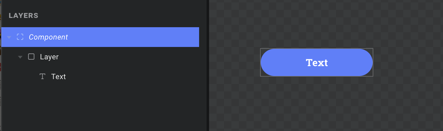
Buttons are a very typical use case for a basic component. They are often reused in several places, and need to look the same everywhere. So to create one, let's just go to the COMPONENTS tab and hit the + button to create a new one just like we would create as scene. Next, make its dimensions something reasonable for a typical button – say, 160 x 44.
You could set the background color directly on the component, but we want rounded corners so we will add a new layer, pin it to all four edges, and give it a radius of half the button height. Lastly we simply add a text layer, pin all four edges again to make sure it stays centered, and style it to our liking. You should now have something that looks a bit like this:
Note: You could add the background and corner radius directly to the text layer if you prefer. But doing it in separate layers lets us add some padding when we pin the edges, if we are worried about the text overflowing.
Step 2: Add props
You may be used to the idea of overrides from Sketch, Framer, etc. Here we have a similar principle, except in Ease Live you can override any property of any layer – text, color, rotation, you name it. Needless to say, it would get messy real quick if we were to list every property of every layer inside each component instance.
Enter props – short for properties. They let you define a clean set of input fields that component instances should receive. You then map them its layers and properties as needed, just like any other data override. This keeps everything tidy, and even lets you reuse the same property in multiple places inside the component.
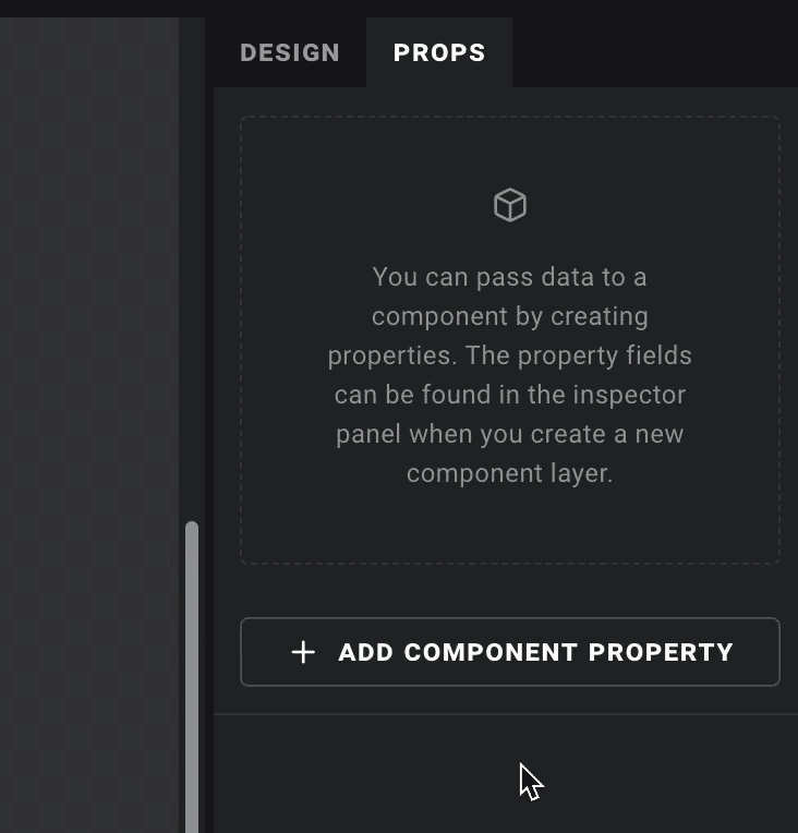
With the root layer of our component selected, let's go to the PROPS tab in the right column. We will add a text property and call it "Label":
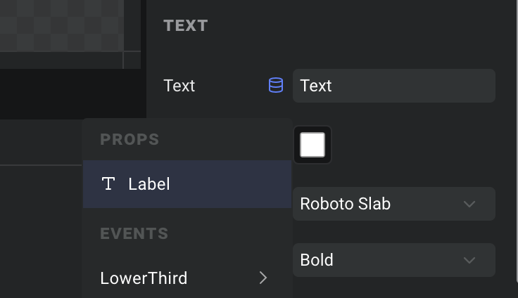
Now we simply select our text layer, click the data icon next to the "Text" field, and override it using our new prop like we would use any other data source. Component props are always listed at the top of the dropdown:
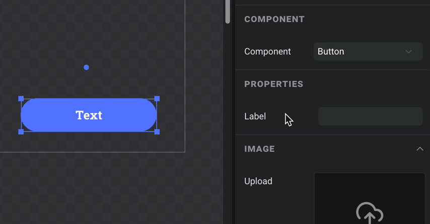
Step 3: Use it
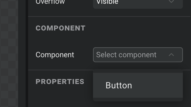
Components can be used inside both scenes and other components. Just add a component layer, and pick it from the "Component" dropdown:
Tip: You don't have to start with a blank component – any layer in the layer list can be converted into a component too. Simply right click it and choose "Convert to component". The selected layer will then be replaced with an instance of your new component.
You will now notice that our "Label" prop is listed in the properties section – let's fill it in and see it in action:
Yay! And did you notice that even our label field has a data icon when you hover your mouse over it? Component props can be hooked up to other data sources just like anything else, making them an extremely powerful an flexible tool for building your user experiences.