Appearance
Data sources: Responses
Two-way communication is one of the most powerful ways to get users to engage with your content. But popular widgets like polls and quizzes have traditionally involved a lot of complexity: producing and displaying content, controlling how often a user can respond, receiving responses, displaying results to both users and producers, handling analytics, etc.
To make your life easier, we have created a data source that manages all of that complexity for you. In the "Data" panel, you will find "Response" in the list of data source types.
Creating a poll
In this guide, you will learn how to make a fully functional poll in a few easy steps. It will be controlled from Cockpit, and send and receive real response data from the server:
If you just want to get to hacking, this poll is available in the package store as "Simple poll". You can also try it yourself right now in Ease Live Play
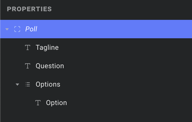
1. Set up your poll event
This is how your producers will air individual polls during your broadcasts. Like we saw in the data source basics, let's add a couple properties to be filled out in Cockpit. We will add a question field, a tagline, and a list of options for your users to select from:
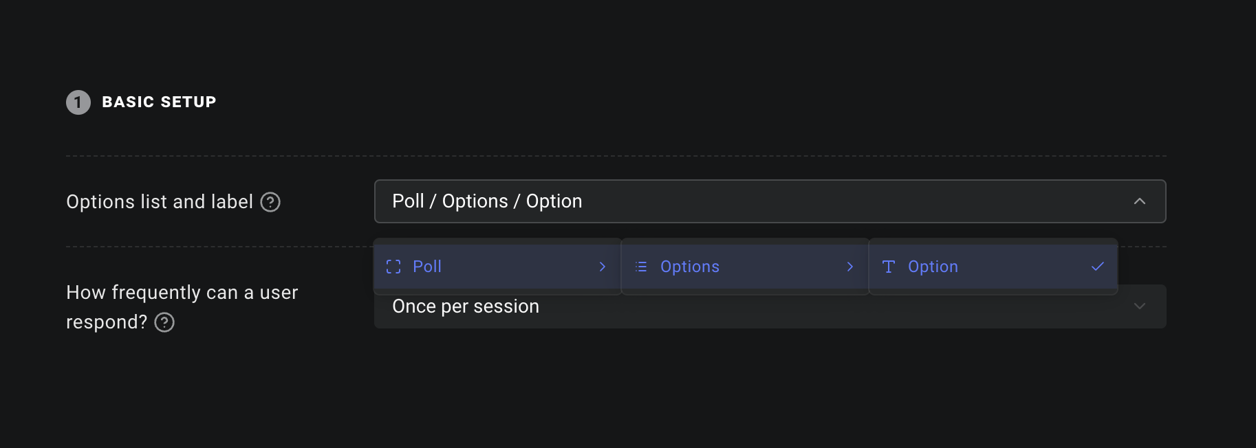
2. Hook it up to a response source
Now let's create a new data source, choosing "Response" from the dropdown. We will name it PollResponse. In the first field under "Basic setup", we will find the event source and options list we just created. From there, we will select the Label property:
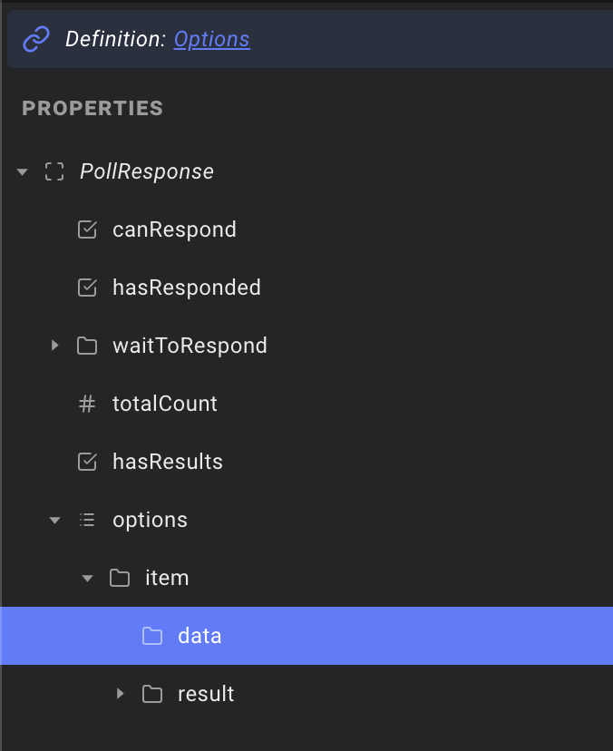
PollResponse will now include the options from your event, and merge it with the response data from the server. That way, when we create a grid layer in the next step, we have a single list that contains everything we need. Notice that if you expand the options list in the PollResponse source, and select the "data" object, its definition now points to our Poll event:
So far so good! Time to draw some pixels.
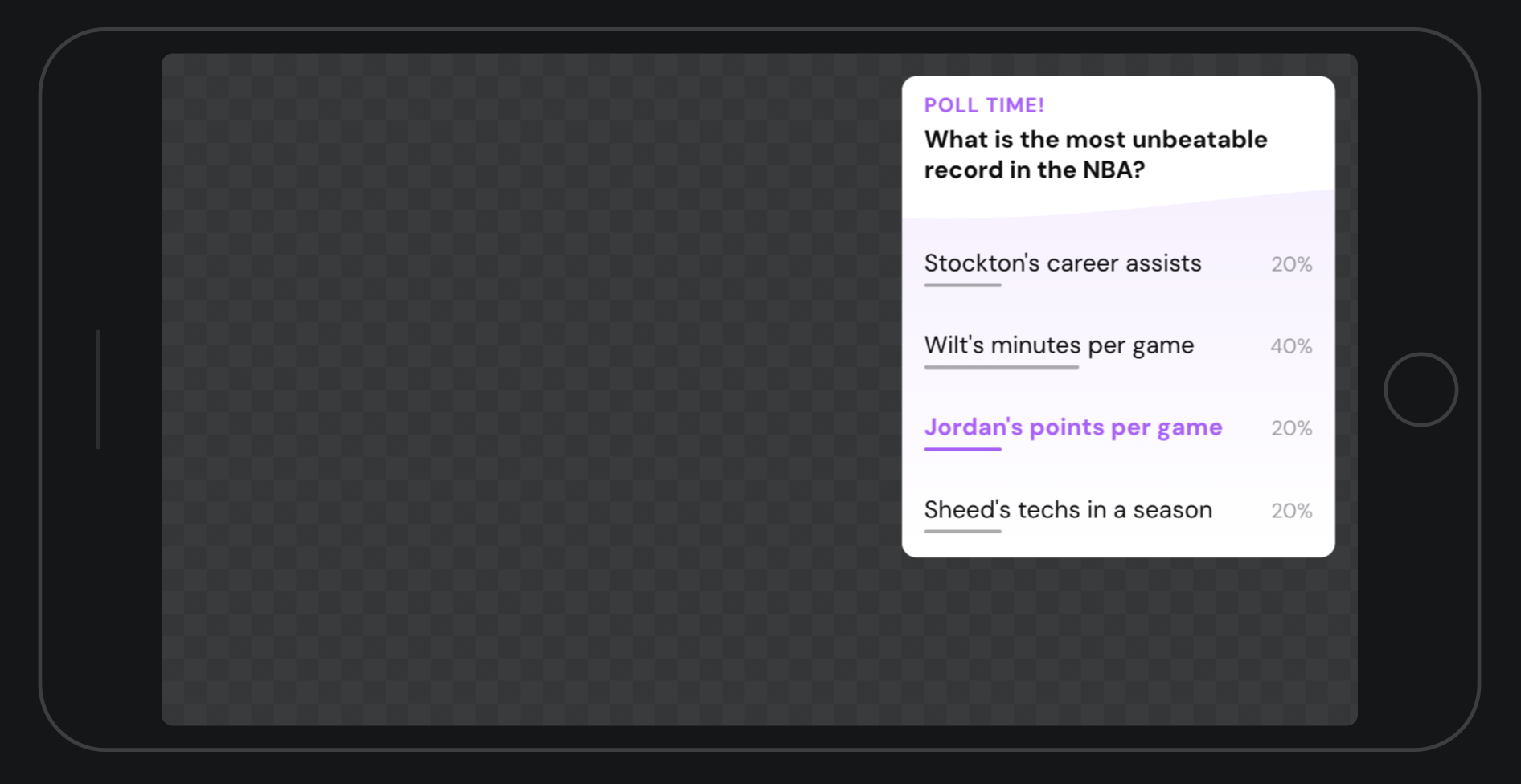
3. Design your poll!
For this example, we have designed a simple poll in a scene like this:
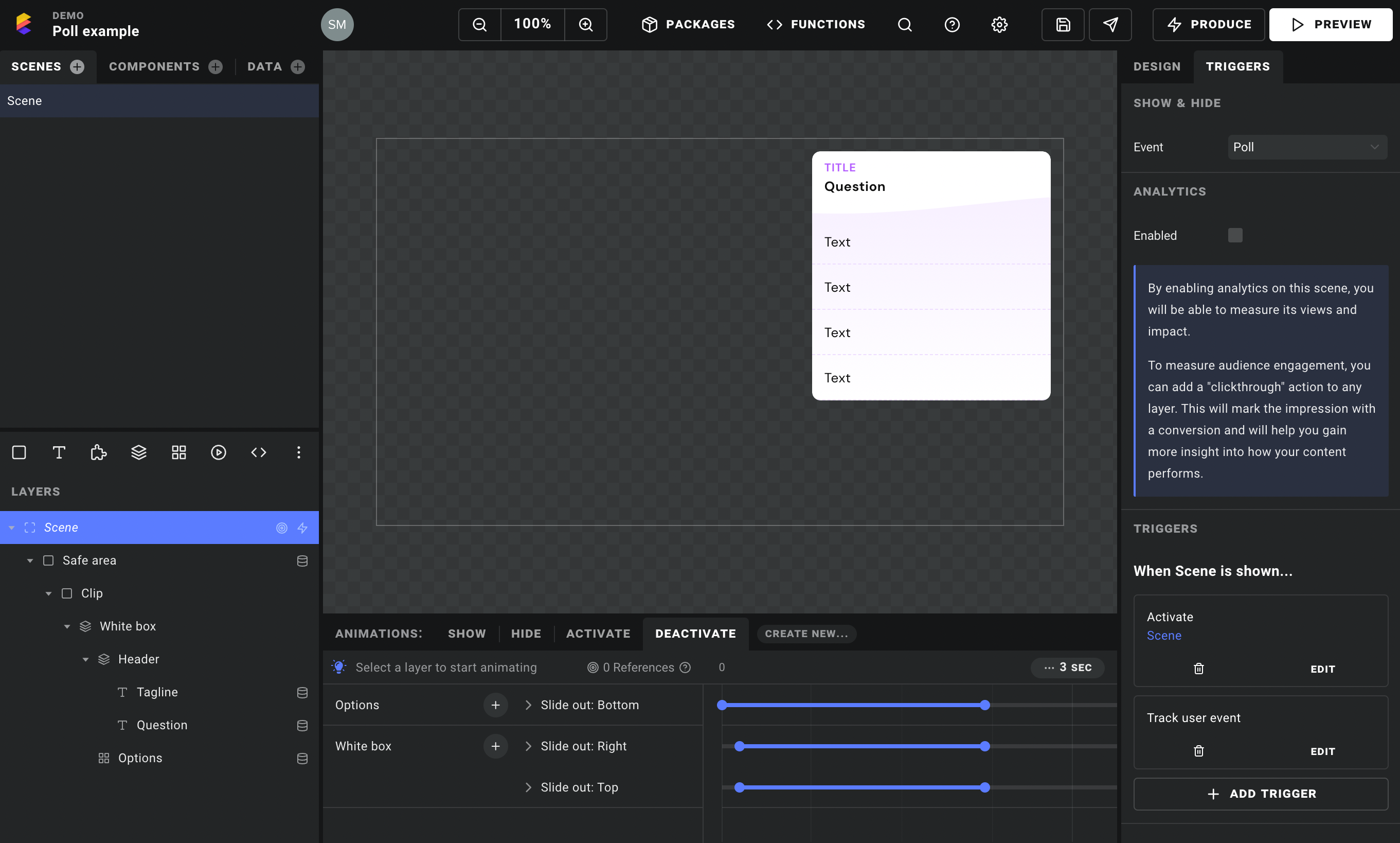
In the scene's "Triggers" panel, we have picked our Poll event to control when it is shown and hidden.
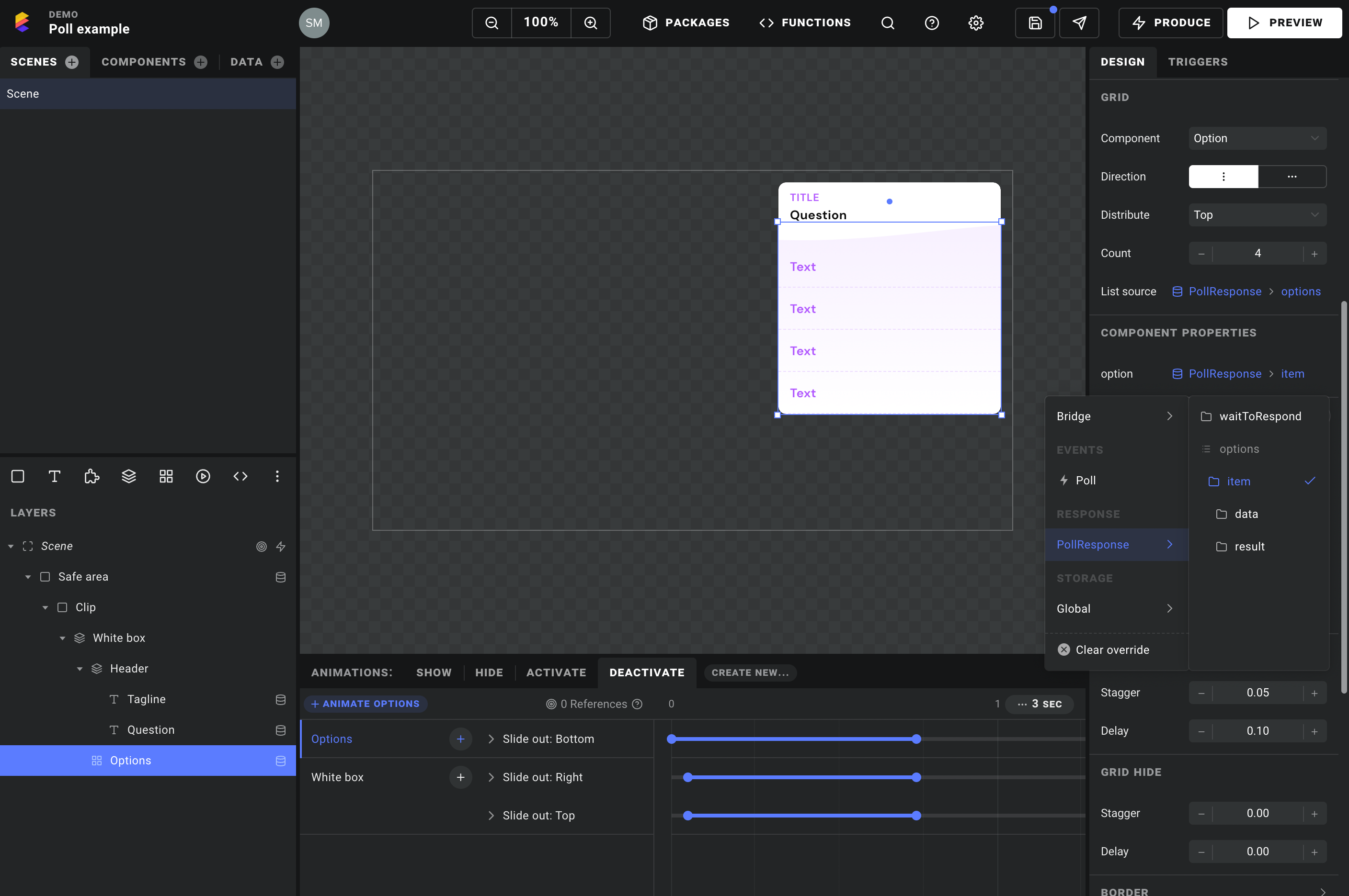
Then, crucially, we are using a grid layer to render a single component for each option row. For now the component can be an empty rectangle – we will hook up its internals in the next step. This is where it all comes together – in the "List source" field, pick the options list from your response data source. This does two things:
- We get a single list containing the data from the event and the results from the server
- It lets the response source automatically fetch results when it detects that the poll is visible.
Outside of the options list, we can grab data directly from our Poll event – like hooking up the question property to our text layer at the top for example.
TIP
In the above screenshot, you may have noticed the trigger that activates our scene when it is shown. This is a handy trick when you want an event to show a scene, but you want the user to control when it is hidden:
- Add a trigger that activates the scene when it is shown.
- Add a
Deactivateanimation that hides your widget visually.
That's it! When the user clicks or taps outside the widget, the scene is deactivated automatically and your poll is animated out. And since the active scene is always visible, it will stay on screen until the user dismisses it, even if the poll is taken off the air.
4. Hook up your option component
In the option component we selected for our grid layer, we will go to the "Properties" tab and add an option property. For its definition, we will choose the list item from the PollResponse -> options list:
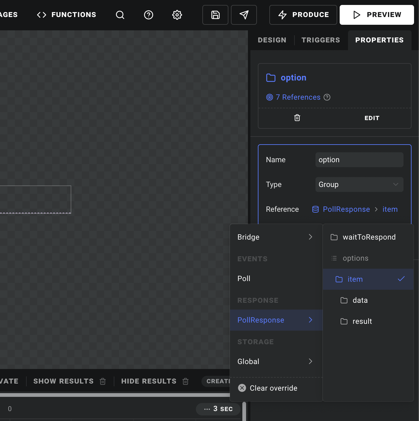
When we want to bind the item's label to our text layer, the data from our event is available in option -> data:
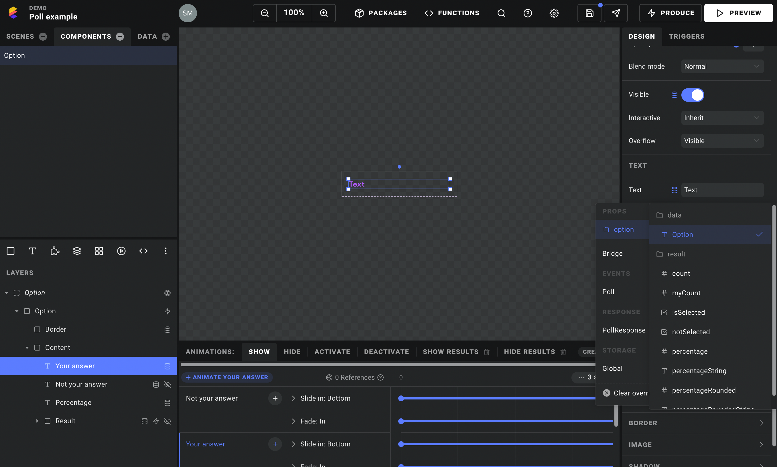
Now for the fun part. Under option -> result you will find things like how many users chose a given answer, the percentage, the rounded percentage as a text string, and isSelected/notSelected which tell you whether you selected this answer yourself. Directly on our PollResponse data source, we have other useful properties like canRespond and hasResults.
Here is an overview of how we have hooked up our data to various layer properties:
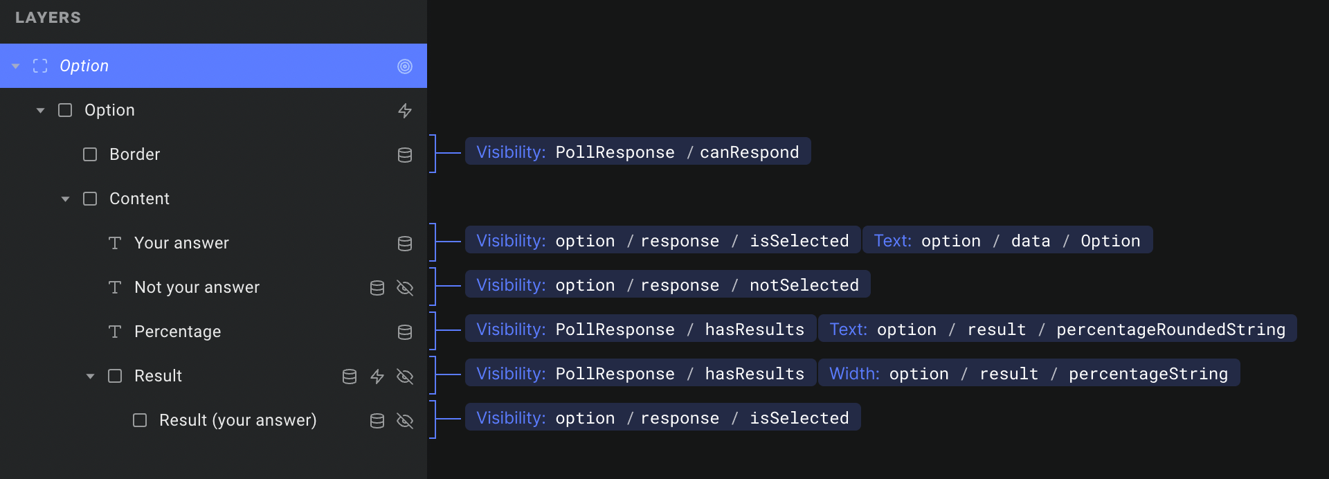
A couple key points here:
Your answerandNot your answerare nearly identical text layers.Your answeris styled to indicate that a given option is the one you selected – hence theisSelectedoverride on the layer's visibility.- Notice that we are binding
percentageStringto the width of theResultlayer, to control the length of the bar below ech result. You cannot enter percentage strings (ie. "59%") in the property inspector (yet), but they do work via data overrides.
Now that we have created our component property, we just have to head back out to our scene and hook up the grid layer that uses it. For the List source field we choose PollResponse / Options, and we pass the item objects from that list to our newly created component property:
5. Sending the response
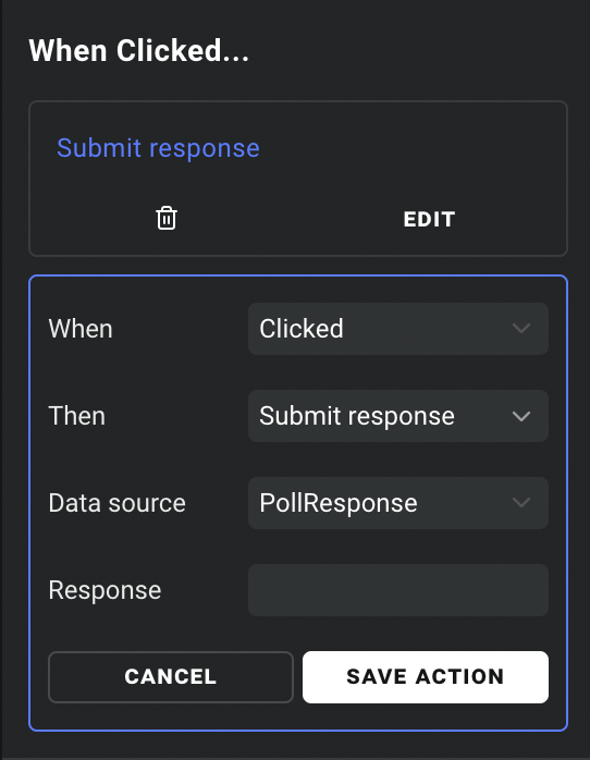
Almost there! Lastly, we just add a trigger to submit a response when the user clicks each option. We double click the grid layer to open our component again, and select the "Option" layer at the top of the layer tree.
Adding a trigger when the layer is clicked, we select Data -> Submit response. Here we will pick our PollResponse data source and we are good to go. Don't worry about the "Response" field – since the component is hooked up to the response data, it automatically knows which option you selected:
6. That's it 🎉
As you can see, most of the work here was just designing the poll, and then hooking up the data to various layers. All of the data handling and communication with the server is built into Ease Live, so we can focus on making cool stuff.
To take it for a spin, open a program in Cockpit and air a poll. You can also check out the various configuration options for the PollResponse data source, to fine tune its behaviour. Those are all explained in more detail in each field's tooltip.