Appearance
7. Making lists & tables
One of the most common and powerful uses of components, is to populate a grid with dynamic data – like a league table or photo gallery for example. Here, we will quickly whip up a practical example of how to use components and grid layers to create tables and lists.
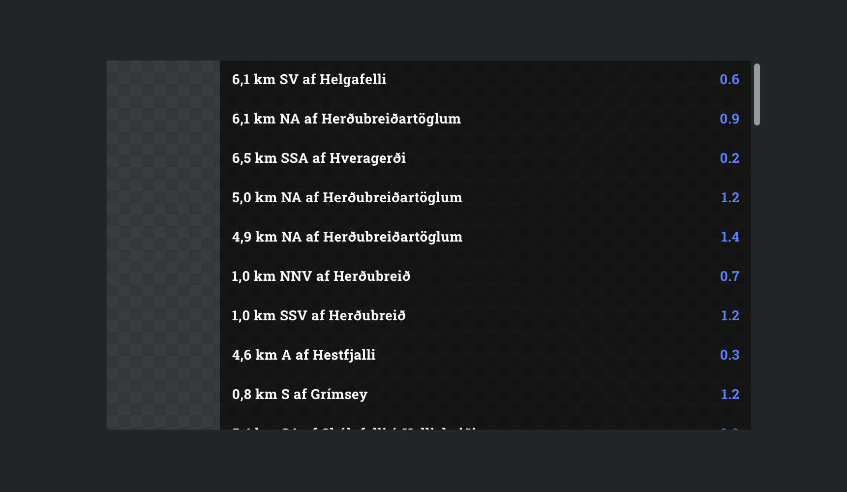
By the end of this chapter we will end up with this live list of recent earthquakes in Iceland, because the API is free and why not:
Step 1: Make a row
Grid layers allow you to repeat a stack of components, for things like lists, tables, news tickers, etc. We already know how to make a simple component, so we won't repeat ourselves here. But for this, you will need a component with a left aligned text layer, a right aligned text layer, and a background color. Something like this:
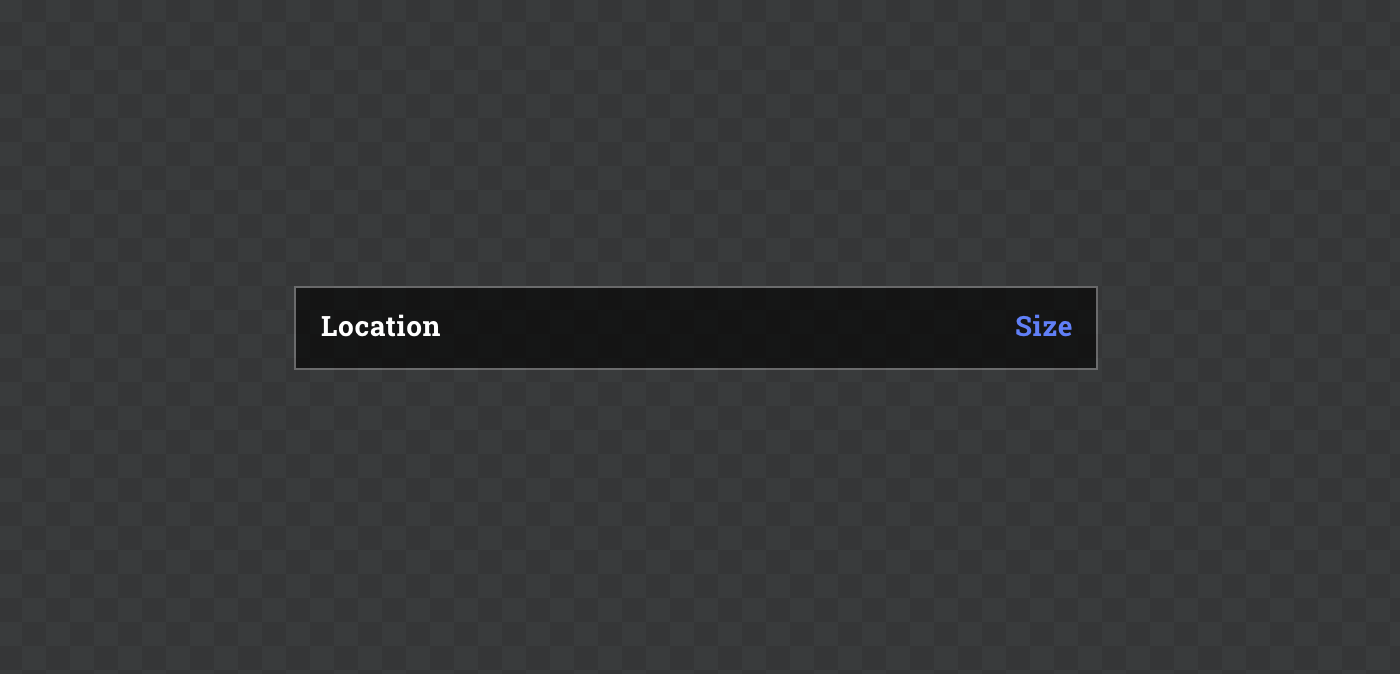
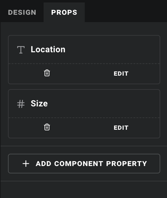
Now let's give our component two props:
- One named "Location", with the type set to
Text - One named "Size", with type set to
Number(we will use this as if it's text, but for this to work the type needs to match what we will receive from the API in the next step)
Your PROPS tab should now look something like this:
Step 2: Get some data
Now let's set up a data source, just like we did with our ISS tracker. Make a new API data source, using this URL:
https://cors-anywhere.herokuapp.com/https://apis.is/earthquake/is
Select "Auto fetch" and click GENERATE. Notice that the "Size" property that we received was a number, as noted by the # icon? This is why the prop we intend to use it for also has to be a number. When you use data overrides, only compatible data properties will be shown in the dropdown for any given field, including component props.
Step 3: Populate!
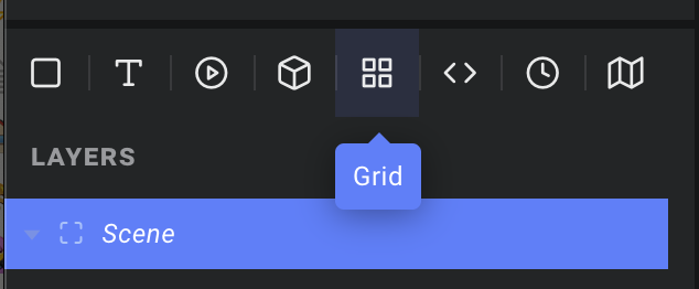
Now for the fun part. Let's create a new scene and add a grid layer. That's this button:
As with component layers, you will find a "Component" dropdown in the inspector. We will pick the component we just created, and then click the data icon by the "List source" field. Here we will choose the "results" list from our new API source. This instructs Ease Live to use the list of earthquakes as the source for this grid, creating one component instance for each item in the list.
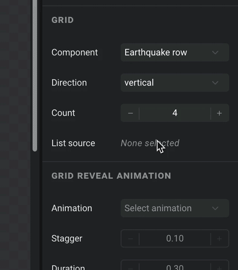
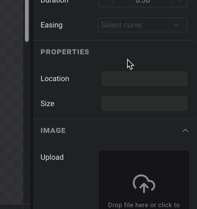
Now scroll down to the PROPERTIES section, and hook up the humanReadableLocation field to the "Location" prop, and the size field to the "Size" prop:
Done! Just make sure your grid layer is nice and big, and you may wish to set its "Overflow" property to Scroll: Auto if you actually want to read the whole list. Note that the length of the list we pass to "List source" will override whatever value you have in the grid's "Count" field. Now just hit preview, and give it a sec to load the data:
And that is all there is to it. Real data from a real API, in a production ready component – built from scratch in minutes, without a single line of code written.
A note on data loading
Note that since the preview shows the component at the same time as it starts fetching the data, it takes a moment before the data turns up. In a real implementation this component would often be triggered by an event/interaction, so the data should be there before the user sees it.
That said, if you want to ensure nothing is shown until it is ready, you can add a computed property to your data source, which you can use to override the "Visible" field of the layer(s) you want to toggle on/off while data is loading. In our example you would make it something like:
jsx
const { data: { results } } = context;
return Boolean(results && results.length);
This checks that the results list exists, and that it has a length. Wrapping it in Boolean(...) just converts that length number into false if it's 0, or true otherwise. This is important, since the "Visible" field only accepts true or false as its override value.
To show a spinner while the data loads you could do the same thing with another property, simply replacing return Boolean(...) with return !Boolean(...) to return the opposite value.